Digital product key trends in 2021 to drive your business growth
March 1, 2021
Each product created always implies AI assistants are a common attribute of many modern vehicles and smartphones. Put simply, it is a system that helps the user to deal with everyday tasks like ordering a pizza or setting an end goal.the story and meaning behind it, designers always find ways to convey the impressive message to their users. And they have a lot of tools to make the story more interesting. Motion design is a great tool and is particularly widely used in digital product design.
Applying motion effects into app design has turned a series of separate screens into designs that come to life and becomes an interactive story that can engage users.
Build the future with artificial intelligence
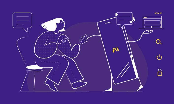
AI assistants are a common attribute of many modern vehicles and smartphones. Put simply, it is a system that helps the user to deal with everyday tasks like ordering a pizza or setting an end goal.
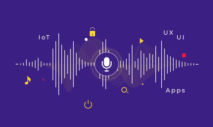
To enter data, users only need to activate the system by giving a command (in most cases, usually via voice), the system will analyze the voice in the form of information waves and respond to the request with a full detailed bridge.
Currently, AI design has two main drawbacks:
- The response provided by a system does not contain much information. The system does not clearly / accurately process your request or what will happen with that information.
- It is a robot. The feedback the system provides does not convey emotion. When a user interacts with such a system, it feels like entering a request for a computer. The only difference from the traditional Graphic user interface (Graphic user interface) is that you use other means of inputting requests (voice vs. keyboard input).
Designers are trying to solve these problems and bring the look and feel of the machine to life.
Today we tell you how we can drive results on this:
VUI helps build user’s confidence

In the future, the AI system will give priority to VUI (Voice User Interface) trust to build users’ trust. Trust builds bridges between man and a non-living machine. Without that, users will not be able to interact with a system.
One of the most important aspects of building trust is giving users a sense of control. The ability to display system status, user control and self-determination – 2 out of 10 usability for UI design by Jakob Nielsen still applies to VUI design.
With the incorporation of VUI into the AI system, the system will easily identify the information the user is referring to and respond to the most accurate way. This feedback will give the user full understanding of what the system is doing.
Visualizing feedback for users
To minimize confusion for the users, designers should focus on developing a system that provides a clear visual or audio response. From there, from both sides, users and application developers will interact more effectively with each other when they accurately grasp the information given.
To design an integrated AI system with visual feedback, designers need to carefully consider which model will best suit their products. In its most basic way, responses can be as simple as a change of status from a blank screen to a content information.
Another way to enhance your brand’s uniqueness into visual feedback is to use animations. With this interface that uses effects, brands will have plenty of space and the advantage of engaging in app engagement behavior to showcase more brand attributes and engage users to interact with products.
For a clear immersive experience, dynamic visual communication can be used. Let’s see how it works in practice; Movement can be used to confirm action. For example “Voice recognition” from Rokid’s case study. The visual feedback makes it clearly visible when the system hears the user, as the sound waves are only visible when the user provides a command. The second example is the “System GUI”, the circle that creates a horizontal movement to indicate a “No” response.
Clarity of state changes
State changes in the UI are typically related to a cut by default – the user sees only two states – the first screen accepts the user’s input and the second as the result. Cuts make it difficult for state changes to keep up and increase cognitive load.
It is possible to solve this difficult problem and make the experience more user-friendly by introducing in between, to create intermediate frames between states. The goal is to make the first monitor smoothly transition to the second monitor. Movement plays an important role in this process – it helps users keep track of the content being guided between views.
Process of Doing (POD)

When a user interacts with an AI assistant, they usually go through three states: Make a request, wait for the result, and read the result provided by the system.
Most users want to know what happens after they send the command and before they receive the results. This information can help the user understand whether the system realized the user’s original purpose.
The POD concept helps designers achieve this goal. Motion design fills in cognitive shortcomings, by giving users an indication of what’s going to happen. Here’s how it works:
- When the user sends a request to the system, the system will immediately simplify the process and display this information to the user.
- POD is not a loading animation; It not only shows what the system is doing while the user waits, but it also provides valuable information about what the system is doing.
Interface conveys personality
Many designers fall into the situation of creating a product, but look similar to every other product in the same category. When users interact with such products, you cannot tell the difference between them. As a result, it is easy to cause confusion between one product and another.
Motion can help designers solve this problem. By adding subtle movements to a design, designers will make the user feel like they are interacting with something different.
Increase the power of small details
![]()
When designers take the time to create unique icons for the project, it draws the user’s attention and makes the experience more memorable. By incorporating movement into awesome icon designs, you can create a truly enjoyable user experience.
Language of movement
Movement can take interactive design to the next level. For each user, when sending commands to an AI assistant, having a story to follow, and good motion-based design helps the designer to “talk” to it effectively. The language we use to tell stories can be deeply connected with the emotions we want to convey to our users.
Humanizing AI system

What makes an interface feel like a human? When it comes to AI support, there are two characteristics that play a key role in how people perceive an interface – voice and movement.
The voice is part of character and shaping. When we associate the voice with something, it becomes part of its identity. We experience emotions when we interact with such an interface, like interacting with real people. And movement can contribute to this feeling.
Designers can apply this same principle to their work. For example, if your product has a mascot, you can make it an indispensable product design, by searching for a suitable tone, rich voice and motion effects.
Conclusion
The technological factors we mentioned above are vital links to the future of digital product development. An innovative, vibrant interface that still brings a user-friendly experience; That is the potential direction that businesses should focus on building their brand differentiation in the market
Keep reading about
LEAVE A COMMENT
We really appreciate your interest in our ideas. Feel free to share anything that comes to your mind.
Our 16 years of achievements includes:
10M+
lines of codes
2400+
projects completed
900+
satisfied clients
16+
countries served


